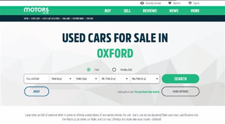
Motors.co.uk has redesigned its website with enhancements to its user experience designed to increase onsite conversion.
The website also has a new look.
Motors.co.uk product director David Hearns said: "The way consumers search for cars is constantly evolving, so it's important that our site does too.
“Smartphone usage brings its own opportunities to create an experience that is optimised for that device, rather than just a squashed version of the desktop site.
“We encourage dealers to look at their own websites on smartphones to ensure response isn't being lost through difficult mobile experiences.
"Our 2018 roadmap has a number of further enhancements planned as we are committed to connecting car buyers and sellers with the best, easiest to use website.
“We pride ourselves on constantly innovating and the positive feedback we get from consumers on the site."
The changes are designed to better match buyers and sellers of cars.
The website has been stripped back to offer a “clean interface” with the Motors.co.uk green - introduced on the site in 2013 - used to empahise key actions including the top level navigation bar, as well as the search and dealer enquiry buttons.
A key driver of the changes has been the continued growth of smartphone usage, representing 56% of total visits in February 2018, up from 50% of visits in February 2017 and 42% in February 2016.
The design changes are also reflected on the brand's content focused sections, such as the Motors.co.uk News blog, Car Reviews and Electric Cars Hub.
Utilising consumer feedback sessions and conversion rate optimisation techniques, Motors.co.uk will introduce further upgrades this year.


Login to comment
Comments
No comments have been made yet.